We were recently inspired by the documentary, ‘The Last Dance’. This docu-series focused on Michael Jordan’s NBA experience as a Chicago Bulls’s All-Star player. In addition, the series also shed some light on Jordan's head coach, Phil Jackson, personal events that impacted his athleticism and insight on key teammates such as Scottie Pippen and Dennis Rodman.
We found this topic to be extremely relatable during these unprecedented times as American professional leagues have suspended their seasons. This was also a great opportunity to dive into non-health/medical data and further develop, enhance, and practice our coding skills.
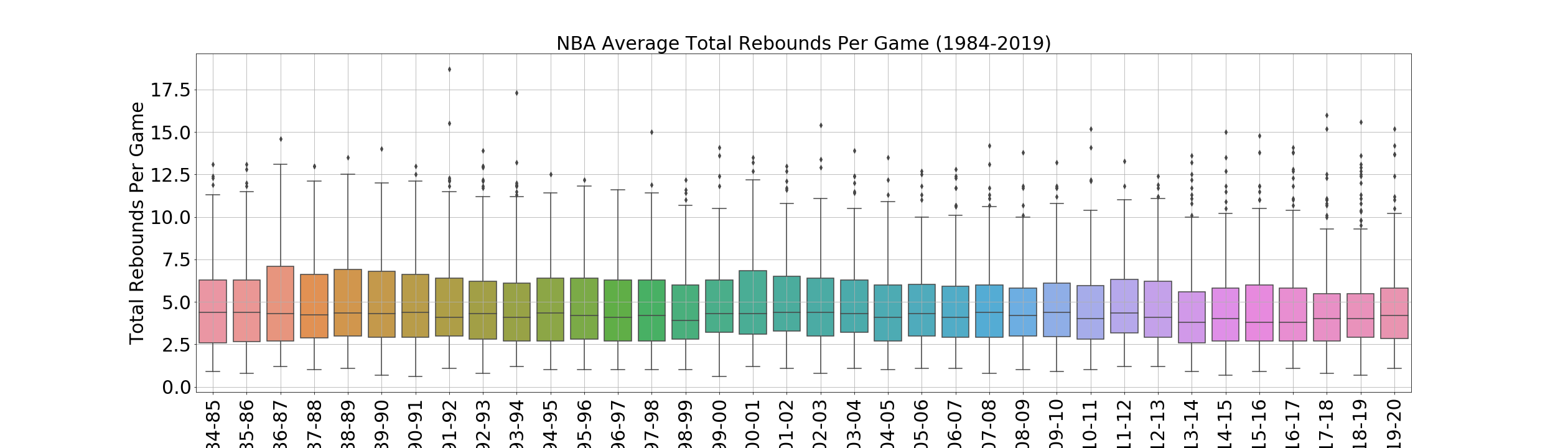
These are some examples of the statistical analysis that I carried out. I used JupyterLab, Python Pandas, Matplotlib, Seaborn, Numpy, Scipy.stats, and Sklearn.
 copy.png)
The plot above compares the average Three-Point Field Goals made versus attempted (1984-2019). The plot shows players increased their attempts to make Three-Point Field Goals around the 2002-2003 season. The color scale on the right side of the plot determines the range of attempts made.
 copy.png)